Spring in the Eastern Sierras {Painting with Frank Serrano}

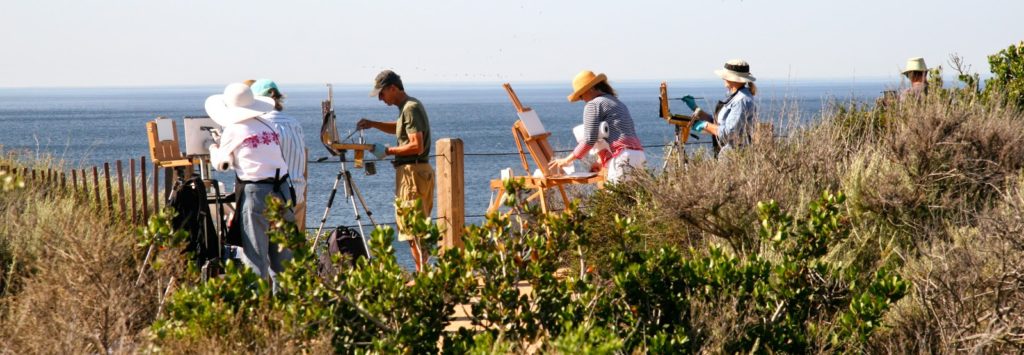
This spring I traveled to the Alabama Hills in the Eastern Sierras for a painting adventure with
master plein air painter Frank Serrano.


{The view of sunrise on Mt. Whitney from my hotel parking lot.}

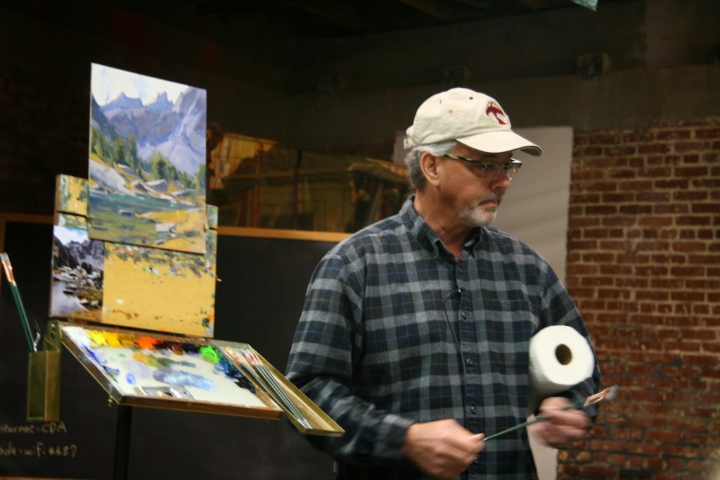
Frank demonstrated painting the backlit mountains, horses, and hay bales,

focusing on seeing correct values–something I’m eager to learn!

{Frank finishing up his demo.}

Later he added a horse and figure in the studio.

Below is the finished piece which he will use as an idea for a larger painting. It was such a valuable experience to see his process moving from plein air sketch to studio.

 {Frank Serrano’s finished sketch.}

{My first painting of the weekend.}

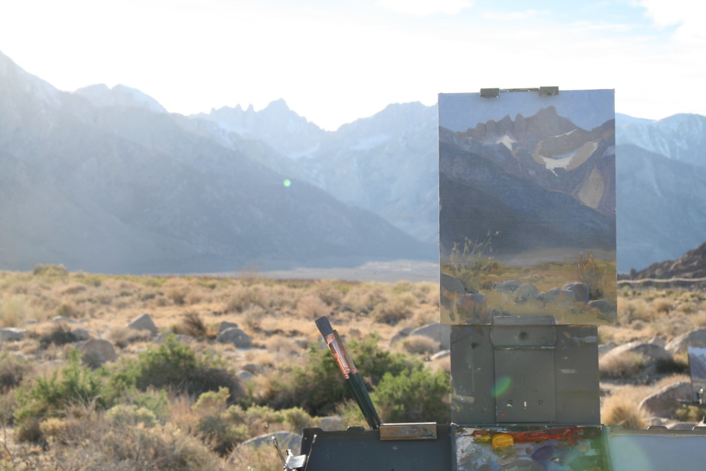
{Late afternoon light on the Sierras}

 {View from my easel.}

The Alabama Hills are a beautiful, austere place and the weekend was filled with good company and great instruction. Thanks Frank!

Things I learned from John Burton {Crystal Cove Workshop}

Workshop participants painting at Reef Point, Crystal Cove State Park.

This week I spent three days painting in the wind and sun with John Burton and several other outdoor painters. We were privileged to attend the first full workshop John has taught in four years and it was a great week–excellent instruction, a friendly and talented group of painters, and a beautiful location.

John’s infectious enthusiasm permeated the group and his mantras are still running through my mind. I can’t wait to work out all I’ve learned in paint on canvas, but for now I’ll just try to record some of what John taught over the course of the week.

“It’s all about relationships!”

John works hard to nail the first few strokes of his lay in:  perfect value (light and dark), perfect drawing (shape), perfect color (or as perfect as he can get). Then he builds the rest of the values, drawing, and color based on relationships: value next to value (is this lighter or darker?), shape next to shape (how does this angle compare to that?), color next to color (is this warmer or cooler?).

In this demo the focal point was the bright yellow house in the distance, so he put that note in early in the lay-in.

He usually starts with the part that is most crucial to what he is communicating in the painting–the underlying abstract shadow structure, the brilliant blue of the distant ocean, or the warm tone of snow in the sunlight compared to the cool tone in shadow. If he can nail that element, he doesn’t have to worry about losing that special part of the painting he’s creating, because every other element is added in relationship to those first most important notes.

“Values, values, values!”

To emphasize the importance of seeing and painting correct values, John encouraged us to paint small studies using the three Portland greys made by Gamblin–light, medium, and dark. He recommends three value studies and five value studies (adding white and black). These studies help to train the eye to see value before seeing color and force the painter to simplify and group similar value shapes, which helps with abstract composition. He often uses these as a warm-up (like stretching before a run) before working on a larger painting.

This beautiful value study was painted by talented fellow workshop attendee, Toni Kellenberg.

 
“Realist painters have to be masters of abstraction.”

Speaking of the abstract, John is clear about his love of celebrating and communicating the beauty of creation through landscape painting and he really gets excited about the abstract patterns and shapes that underly nature. The artist has to be able to interpret lights and darks, combinations of shapes, and the nuanced variety of colors in a way that satisfies a universal recognition of beauty and harmony. The realist painter is not painting a tree, he or she is painting a darker shape intersecting with a light shape, or a large mass balanced by a small mass.  In order to see these harmonies and patterns without the distractions of recognizable “things,” John often flips his painting over after the initial lay-in to see how the abstract patterns read.

As he neared the end of this demo, John flipped his painting over 
to see how the abstract shapes worked together to create a pleasing composition.

 
“If everyone else is making one painting a day, you should be making four!”

John exudes a joyful commitment to hard work. He encouraged us all to paint more, pursuing the mastery of the skills of painting and drawing with diligence. I know we all left the workshop with new ideas about how to use our painting time well, and plenty of motivation to find more time to paint. He compares painting to playing the piano–it takes hours of dedicated practice and familiarity with the instrument (always set up your palette the same way!). Great painting is also like great music in its lyricism and passion.

Notice the interplay of the lost and found telephone wires 
and the soft cloud shapes–poetry in paint!

“Never stop learning!”

Even though he is a renowned master painter, John doesn’t settle into always doing things the same way. He eschews formulas. He constantly changes his palette, is always eager to hear ideas from other painters, and doesn’t insist that the way he does things is the only way to do them. He’s recently been experimenting by using sight-size for both drawing and matching color. And he’s taken cadmium yellow lemon and alizarin crimson off his palette for a time in order to force more inventive ways of creating color relationships in his work.

John completed this 30 x 42 demo painting in a little over an hour 
while listening to classical music–his usual accompaniment in the studio.

 
John invites his students into an exciting journey of discovery and dedication to the craft of painting. I left his workshop inspired and encouraged to keep working hard to improve as a painter. Can’t wait to get back outside and get at it!

(I’ll post pictures of a few of the paintings I created during the workshop soon!)

Matt Smith Workshop {part I}

This week I had the great privilege of studying with Matt Smith, acclaimed landscape painter and inspiring teacher. He packed the workshop with lecture, demonstration, and individual instruction. I want to record some of what I learned here.

Painting from Reference

The workshop focused on the process of painting from photographs and plein air sketches. Matt approaches the photo reference with the understanding that the photo always lies at some point and often many. Ask, what’s wrong about this–value, color, perspective? Use your experience and memory gained in the field to correct your reference. Painting well from reference requires lots of practice painting from life.  He encouraged us to crop our reference images, rearrange elements, and to consider different formats. Do not depend too much on your reference; use it as a starting point for your painting.

Matt’s reference photo. Notice how he simplifies and rearranges elements.

Painting Demo

Drawing Stage:

  • Only tone the canvas if you have a reason to. In this case the foreground was fairly warm so he toned just that area. Keep the tone neutral.
  • Before you get started know where the horizon line is, what the focal point is (what is this painting about?), and what the (3-5) big shapes are.
  • Draw in horizon and large masses.
  • Connect the darks (shadows)
  • Think about the design. What will lead the viewer into the painting?
  • Balance the painting left to right, top to bottom, and front to back.

The drawing stage is finished and he’s moving on to blocking in value and color. Notice how the darks are connected and how he’s created a line that guides the eye back to his focal point.

Block-In:

  • Start with thin paint. (Matt’s only medium is Gamsol.)  Paint the darks first.
  • Put enough paint on the canvas to really tell if the value and color are right.
  • Paint in other masses in relationship to the first–lighter, darker, cooler, warmer.
  • Use a different brush for each major value/color shift.
  • Paint in all the large shapes, then large variations within those shapes. This stage is about proportion and relationships.
  • If the painting is about the shadows, simplify the highlights. If it’s about the lights, simplify the shadows.
  • Work clean! Clean the palette often. Use a new brush for each major value/color change.

Almost finished with the block-in. Notice how he saves the sky mass until the others are established.

Fine Tuning:

  • Paint variations within the darks and/or lights.
  • Consider the differences between form shadow and cast shadow. Form shadow is usually not as dark because of reflected light bouncing back into the form shadow. Cast shadow has a bluer hue because of reflected light from the sky. Reflected light (in a shadow) is usually warmer near the reflected light source.


Notice how darks are still connected and masses are simple. You can see the difference between the form shadow and cast shadow on the distant mountain.

  • Paint in the sky after blocking in the other masses, otherwise you may key it too dark.
  • Use a crosshatching “velour effect” to create interest in the sky.
  • Add touches of blue/veridian to lighten the sky near the horizon.
  • Design idea: As Edgar Payne did, try putting the warmest tree in front of the coolest background. This will create a focal point.
  • Cloud idea: Paint the warm violet shadow first. Use white and burnt sienna for highlight. Soften transitions.

See how he adds the snow and the cloud–first in shadow (above) and then in the light (below).

  • Slow the movement of a strong downward stroke with perpendicular contour brushstrokes.
  • Re-establish the darks if they get lost. This brings back the original underlying design and cleans up the drawing and perspective.
  • Know how to build the paint: grey to rich, dark to light, thin to thick, large to small.
  • Now amp things up–warm the reflected lights, work the edges, more paint, create planes that add depth.

 Note the more intense blue in the water, the details of the tree trunks, and the slight adjustment of rocks in the foreground.

It was such a gift to study with Matt Smith and to be among such a generous and talented group of painters. I’m looking forward to assimilating what I’ve learned into my own painting process. It’s wonderful to have some direction and inspiration for the painting ahead!

UPDATE: Here’s the finished painting Matt posted later…